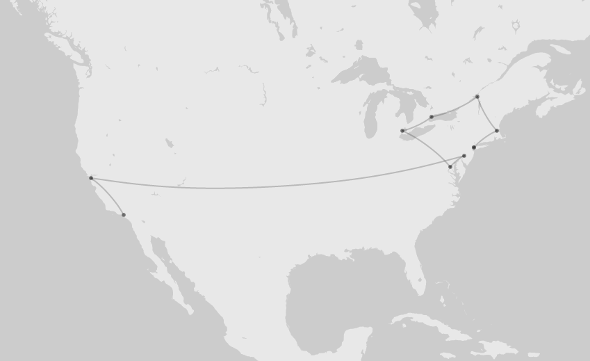
My fascination with impresarios stems from the way their labor is often hidden in how we narrate dance’s transnational circulation, in particular our tendency to focus on stars and companies, rather than the negotiations through which they were brought to specific places at specific times. The New York Public Library Performing Arts Division’s archives associated with the impresario Sol Hurok are full of material related to such negotiations, from the bonds paid for international dancers to enter the United States, to speculative reports on touring to South American locations, which stipulate that dancers must arrive several days in advance in order to acclimate to the elevation. I am interested in how visualization techniques for digital history might help to animate such work.
This data for this post comes from a one-page travel itinerary for the Leningrad-Kirov Ballet’s first tour of the United States in 1961 that lists dates, cities, names of auditoriums, and auspices. When I plugged this data into a csv. file and then into the Palladio tools that are under development at Stanford’s Design+Humanities Lab, two things struck me. The first was the way such techniques enable us to feel the passage of time differently. After entering date ranges (i.e. “Nov. 10-12 / mat. & eve. on 12th / Nov. 14-18 /mat. & eve. on 18th”) into a list of all 77 shows, and adding tables with geographical coordinates, I created a map with points sized to represent the number of appearances in each auditorium. Using the time slider further enhanced the experience of duration, by animating that sequential passage across the United States and Canada, as well as the accumulation of events. In my dream world, there would be date and show counters imbedded in the map itself.
The second thing that struck me was how even this type of time-based map is still focused on the shows themselves and not the act of travel. In the 1940s, for example, one company forced Hurok to add a rider to their contract, in which they demanded Pullman Sleeper Cars for any travel between the hours of 10pm and 8am (unless the war prevented it). Likewise, what is clear when looking closely at this itinerary is its punishing pace, most often finishing a show in one city on one night, traveling the next day, and appearing on stage in a new city the following evening. In some ways, the point-to-point lines can help to draw out this element of touring, as not only in places but between them. At the same time as they privilege the route, however, they risk losing duration, for example, when I am not zoomed in closely enough to mark the transition in New York City from the Metropolitan Opera House to Madison Square Garden.
One of the things that I am still struggling with is how to deal with the simultaneous convergence of multiple events, which is one of my goals in visualizing dance touring. In Palladio, it is possible to set up secondary and tertiary tables, not only for necessary information like geographical coordinates, but also to account for what else is going on in the world at a given time, in this case, the Cold War. For example, it was during the Leningrad-Kirov Ballet’s Washington D.C. performance that the Soviet Union tested the most powerful nuclear weapon ever detonated. Via Palladio, this is best represented at the moment in list form, but it lends itself to thinking about how this convergence might be better visualized. For example, in a map form, would it be that the map suddenly rescales at a critical moment, to encompass not only Loew’s Capitol Theatre (38.89,-77.03), but also the site of the test at Sukhoy Nos (73.51,54.59)? Or would that make it seem more, rather than less distant, from the day-to-day lives of the dancers on tour?

2 comments